Showing posts with label InkAid. Show all posts

Sunday, 16 March 2008

Experimenting with snowdrops

Prompted by a photographic/art competition at my OH’s place of work I decided to do some more experiments with multiple print-offs and use up a piece of left over Sanwa tissue from my InkAid experiments.

On a recent visit to the Focus on Imaging show at the NEC, Birmingham, I bought a pack of computer pintable canvas, so I was quite eager to try this out.

I started with an image of snowdrops taken recently and printed it straight using the settings suggested by the manufacturer.


As this was a very strong image I wanted to knock it back a bit so put a ‘rough pastel’ filter on it in PS.


I printed this onto the Sanwa tissue, which has gold and silver flecks in it.


I fused this over the original caves image using the wonderful misty fuse that Debbi so kindly sent me.

I still felt that there was more I could do to enhance the textural feel of this image so I printed some lacey tissue with the original image to put some definition back into the piece. I then fused this to the Sanwa layer.


It was my intension to stitch into this piece, but after having tried endless different ideas on a PC size piece I gave up and decided it wasn’t suitable for stitch.

See what you think.

The quality of the pics is nowhere near as good as I would like, but it was a very difficult subject to photograph and I had to do it with the aid of an angle poise lamp, not the best of solutions to a cold wet day!!

Saturday, 2 February 2008

InkAid experiments part 2

As I mentioned in the previous post, I was using some of the IA samples in a piece of work that I thought I’d document on the blog, as it covers computer techniques as well and it will help me remember exactly what I did, for a change.

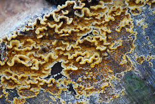
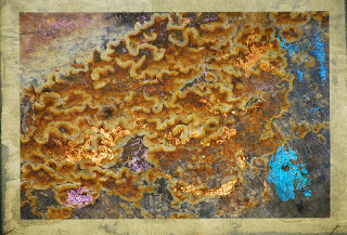
I started with one of the images that I took on my first trail run with my new (well second hand) Nikon D200.


I printed this image onto Gimpy tissue, which was coated with IA iridescent gold as mentioned in the previous post.

When I removed the tissue from the paper I had stuck it to print, it left an impression behind that I thought might be useful, so I scanned it into the computer and then strengthened the color of the image by going to, image-adjust-hue/saturation and playing with the sides until I reached the color depth I was looking for.


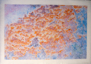
I then printed this onto a piece of Abaca tissue that was not precoated, as I didn’t need a very strong print because this was destined to go under the Gampi tissue.


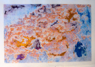
I then added some of the foil that I’d bought from Fibre in Form using the turquoise, gold, copper and purple to match the colours seen in the original image. I found the best way to achieve a distressed look with the foil was to put down a very thin layer of diluted PVA and then lay down a piece of foil, shiny side up, in the place required. I then applied the iron gently on a wool setting before the glue had dried.


Once I was happy that I’d achieved the effect I was after I bonded the under layer to the top with Bondaweb granules.


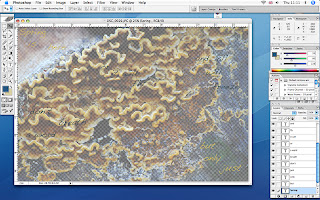
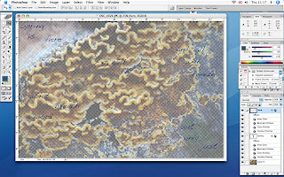
I now thought it would be nice to add some text and played around in PS with several text layers on a background of the original image, that I had lowered the opacity on. A PS tip here is that if you want to make your BG into a layer so you can work on it with filters or lower your opacity, you only need to double click the BG in the layers palette and that will give you the option to make it a layer.


Having got the text the right colour I decided that it didn’t stand out enough so I added a treatment to it in the Layer-layer style-blending options-styles palette.
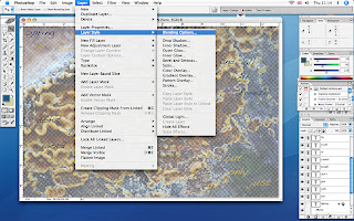


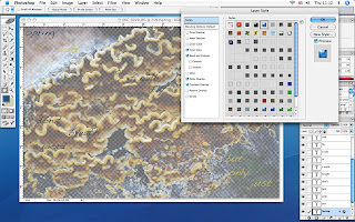
I chose a style that gave a blue glossy embossed look, but there are lots of lovely styles to play with in this palette, it’s well worth having a play!


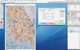
As you can see all the text is in different colours and I wanted to apply this layer style to all the text. To do this I made the BG layer disappear from view by clicking the eye in the layers palette (sorry no screen shot for this), this then just left the text layers visible. Now if you go to the layers pallet and click on the fly-out menu at the top you’ll see the options in the screen shot below. If you choose merge visible it will flatten all the text layers allowing you to apply this style to all.
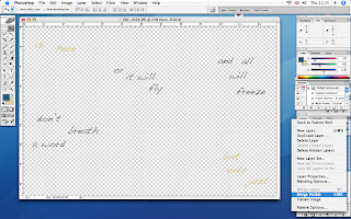


And finally you have the text layer with the embossed style over the BG layer.


The experiments for printing this part of the piece can be seen on the previous post. I wasn’t happy with the results I had achieved with the sheer so I tried again.

The only problem was that I made the classic mistake of not saving the image file above, or loosing it in the vast expanse of my computer’s hard drive!! So I decided to make a simpler version, and this time I used IA Semi gloss precoat on very pale yellow nylon sheer, and gave it 2 coats.
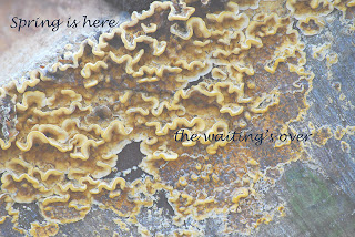


This worked far better than the previous sample, leaving very little ink on the paper and I think that may have been caused by the bubbles that I created when I coated it, haven’t quite got that one right yet!

My only concern with this technique is that it does make a very plasticized finish, which I don’t really like, but it did print a very good image on the nylon sheer, and I don’t know of another method that can achieve this.

When I bonded this top layer to the middle layer the registration of the two images we slightly out giving a blurred effect, which at the time I quite liked, but now I wonder if it would have been better to have kept the crispness of the original image.

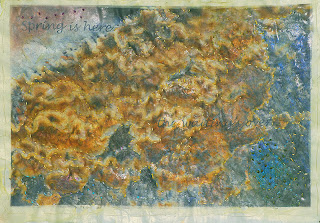
Finally I put all the layers together and put a layer of thin wadding underneath with a backing of fine Indian cotton, bought from a luscious Indian fabric shop in Cardiff. I then proceeded to embroider over all the layers with Running stitch and French knots using hand dyed silk threads, also bought in Cardiff at the Crafts in the Bay Centre. The result was still not quite right so I tried the heat gun on it but found that the IA precoat didn’t allow the sheer to burn, so it only distressed in places where the precoat was at it’s thinnest.

I will live with this piece for a while and see if I can think how to improve it, unless anyone has any better ideas!
Tuesday, 29 January 2008

InkAid experiments

I‘ve been trying out an introductory set of InkAid samples over my last two DCD’s and decided to record my findings as you always forget how you achieved the results of the experiments almost immediately.

For those who are not familiar with IA as I wasn’t, till Shirley introduced me to it, it’s a series of different mediums that you can paint on to anything you can safely feed through your printer.

First of all I took 7 different surfaces to paint the different solutions on to.
Japanese Sanwa tissue, painted with semi clear gloss
Gampi tissue, painted with iridescent gold
Albaca tissue, painted with clear gloss
Silk organza, painted with precoat type II semi gloss
Nylon sheer, painted with white matt
Lens tissue, and tracing paper painted with adhesive
Velum, painted with white matt and adhesive.

To understand the different properties and uses for each of the above samples I went to the this site and followed the instructions for each of the samples in my pack.

Using Shirley's advise, I set out a plastic sheet and painted each piece in turn with a sponge paint brush, but I think maybe a block of foam would have been easier as it makes less wrinkles, according to Shirley, I held the pieces down with metal rulers, as it would have been difficult to tape some of the finer tissues.


The first piece I printed was the lens tissue, and although I’d painted it with the adhesive which was for non porous materials as I thought it was, the printer wheels slipped over the crispy surface and left drag lines on the image, so undeterred I had another go on the abaca tissue, a much softer tissue, which with the help of the clear gloss precoat gave a similar image to the one I’d achieved before on tracing paper, but this tissue is stitchable.


The next sample I tried was the nylon sheer, which was painted with the white matte precoat as this is designed for nonporous materials. When it dried it had some large white puddle marks on it, so I can only assume that I painted the medium on too thick. But it did print, which is the first time I’ve been able to print sheers. I deliberately put a low opacity on this image as I wanted the layers beneath to show through, but if I’d printed it with a high saturation it would have printed even better, maybe 2 coats of precoat next time.


This piece does have some text on it, as I wanted to add it to the layers I was compiling for a piece, which I will publish when it’s finished.

I printed this same image onto silk organza, coated with precoat type II semi gloss which gave a much better effect.


Another part of the above piece is the starting layer that I printed onto Gampi tissue, which was coated with iridescent gold. So far this piece has been the most successful for the image that I was using, it gives a lovely pearlised finish, which just glimmers through the image.


I still have a couple of samples to try for this experiment and will document them at a later date, together with some test samples that haven’t been precoated. All the paper samples were bonded to pieces of photocopy paper with spray mount before putting through the printer, and the fabrics were ironed on to Freezer paper.

The tissues and the InkAid sample set were purchased from ArtVanGo. I also bought a very good book on the subject of Digital Printing from AVG, which again was recommended by Shirley who is a mine of information and has very generously shared her knowledge with me.