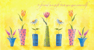
My first choice of design possibilities, as always, was to scan the image into PS and isolate the design.
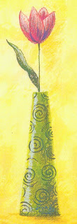
Next I wanted to take the flower off the BG as I wanted to incorporate a BG design of my own. I did this using the Polygonal lasso tool, which you can see greyed out in the tool box (upper left of pic below). This is a nice selection tool as it allows you to make jumps as you select and then smoothes out the curves when you’re done. I set a feather value of 10 (also upper left in pic just below the edit menu) as this gives a nice soft edge to the selection. It must be done before you make the selection.
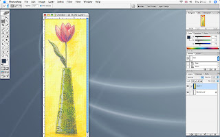
Having got the selection I then cut and pasted it onto a new image that I made the size of the finished PC.
I now pasted another BG of a bark pic under the isolated flower.
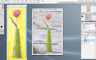
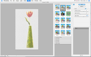
I now returned to the flower layer and put a Cutout filter on it, Filter-Artistic-Cutout, (see settings below).
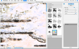
For the bark BG I put on a Water Paper filter, Filter-Sketch-Water Paper (see settings below)
I order to knock back the bark BG, as it had now become too dominant, I put on a gradient map, and you’ll see the route for this effect in the screen shot below.
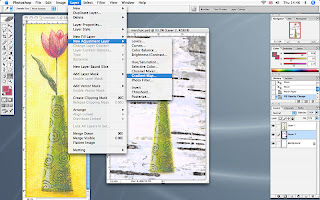
And this is what the gradient map menu looks like when you select the arrow to the right of the bar that says, ‘Gradient used for greyscale mapping’. You will then get a menu that has a second fly-out menu and you need to choose special effects here. I chose the green one as it colour matched the vase.
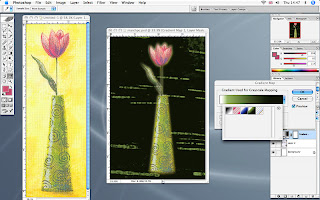
The effect was a bit too strong so I went to Edit-fade gradient map and dropped the opacity till it looked right.
I now decided I’d quite like to make a feature of the swirly patterns on the vase so I selected the vase layer and using the circular marquee tool (greyed out, top left in the tool box, see pic below), I copied and pasted three of these shapes onto the BG and changed the scale (Edit-scale) of one of them just for balance.
I made sure to put them under the gradient layer so they didn’t look too stuck on!!
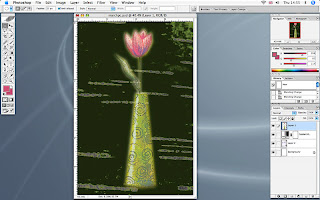
By now I’d decided to change the flower a bit more and put another effect on it, this time the Solarize filter, Filter-Stylize-Solarize.
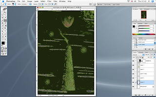
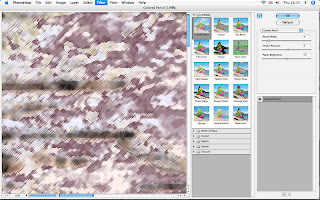
I still wasn’t happy with the way the BG looked so I played around with a few effects and decided on the Coloured Pencil filter, Filter-Artistic-Coloured Pencil, and this gave the BG a bit more texture.
As a final touch I added some of the text that was on the original image and gave it a curve in the text pallet, which is on the top bar and has a T with a curve underneath, (this only shows when you select the text tool from the tool box).
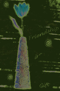
So now all I have to do is translate the design into a PC, which should be an interesting challenge.
8 comments:
Can't wait to see the PC! Whilst logically I know that what the source is, you've added so much to the original that my mind can't connect them!
Blimey you don't let the grass grow under you do you ;) I thought I was working on the wrong picture until I realised you are starting on March already.
I don't know whether my Photoshop Elements is up to this but I'd love to have a go. I'll look forward to seeing the postcard.
Thanks for showing us what you did with Photoshop. You can spend hours just on the design part of it messing about! I'm a little ahead and I was messing about with Photoshop for the March swap it was an absorbing experience. When you see my PC, you will probably laugh at what ended up on the PC from Photoshop but I had fun.
I don't really understand all this photoshop stuff but I like the end result.
thanks for sharing in such detail - I'm fascinated to see how you achieved such a wonderful effect
This is going to be another wonderful design from you Sharon.
Your 'step-by-step' makes it all very clear and understandable.
Fantastic process Sharon!! One day I will have a play with images too.......you make it sound so easy (well sort of!!).
Post a Comment