Wednesday 27 February 2008

Happy surprises


Today was a day full of happy surprises. First of all I received a lovely big couple of samples of Misty Fuse, from Debbi and she even thoughtfully put in the instructions for me, aren't bloggeres wonderful.

Debbi also awarded me the 'You Make my Day' award, which was such a lovelly surprise, I was very touched.

I also received this award from Sue who hosts a lovely blog with all sorts of interesting posts.

I felt very honoured to be given this award twice in one day and in the same spirit I would like to nominate the following bloggers for thier wonderful blogs that are a constant source of inspitation to me.

Ro for her wonderful colourful and inspirational artwork and jewellery.

Deidre who never fails to give me something to ponder over, and who takes the most amazing photos.

Vivien who's paintings are to dye for!

And lastly for now, as I have a problem with my computer and am having to hand code the links :-( Becky who always has something ditfferent and exciting on her blog to share with us.

Saturday 23 February 2008

Cyber Fyber Exhibition Post Card

I've finally finished my Cyber Fyber PC, which I will be sending off on Monday for the exhibition.(There are a few trades left so if you want to take part you better hurry over to the blog.) I wanted to do something glitzy this time as it's a celebration of textile blogging.

I decided to use the artwork that I had created for the CG PC for March.This is a loose interpretation having lightly sketched in the outline of the flower and vase in Fiber Etch, from AVG, on synthetic velvet that had first been dyed with Procion dye.

The Fiber Etch ( Instructions come with the solution) burns away the velvet pile and leaves just the synthetic undrelay. The more you put on the more it burns away and will make nice distressed holes if that's what you're aiming for.


I now decided to exploit the colours that I'd developed in the original artwork (see pic below) and started bonding foils and painted Bondaweb to a piece of cream Viscose Satin. You can't see the Bondaweb now as it's almost all been taken over by the foil.


I bonded the two layers together using a needlboard so as not to crush the velvet pile, if you don't have one you can always use a towel.


To give the BG some texture I did some random FME in a matching embroidery thread and over stitched this with a fabulous Gutermann/Sulky polyester thread. It behaved beautifully on my ancient Bernina 1130, as if to prove a point that there's life in the 'old girl ' yet and I don't really need to trade up to an Aurora 440 QE, or do I?

I finished off with some lovely seed beads bought at my favourite bead shop by the sea, and as the exhibition has been so lovingly organised by the lovely Susan I thought I'd add these lovely silver hearts, purchased from 'you know where'.

And here's the final PC, just using the left hand side of the original sample, the right will be used for the CG PC.

Wednesday 20 February 2008

Out and about

As most of my creative projects are WIP's at the moment and not ready to be shared I thought I'd show a few more pics that I've been taking while we had that lovely spell of sunshie, that seems to have depressingly disappeared today.

On Sunday we went to our local Arboretum and as usual I wanted to take a pic of this beautiful bloom that was all but buried in the surrounding foliage. My poor long suffering OH can never understand why, I simply must take a pic of something in deep shade and in an impossible position, but it has to be done! After much fiddling about wrestling with the new tripod, a veritable beast, but wonderfully sturdy and a very timely pressy from my OH, I got the pic I was after. Hope you think it was worth it.


A very thoughtful volunteer saw us armed with more camera gear than is really sensible and kindly pointed us in the direction of the drifts of snowdrops, and what a sight they were too. Of course my OH had to lay flat out on the ground to get the best shot and a passing child was heard to remark excitedly to his Mum 'Mummy, Mummy, there's a soldier lying in the grass, and he's got a gun!" To which his Mum explained that it was just a man taking a photo wearing clothes that looked a bit like army camouflage. I think he was a bit disappointed!!
Anyway I got my shot without having to resort to laying in the wet grass!!


As we continued on our walk my OH discovered this sawn stump and I liked the pattern so much I thought I'd have a go at recording it, I think he was a bit disappointed when we got home that he hadn't bothered to take the shot, especially after he pointed it out to me!!


Continuing on the textural theme, I saw these amazing fungi on Monday when I took Ben (GS) out on a photo forage in our local woodland, these were right up the top of the tree so I think the camera/lens and tripod did a good job.


A little out of sequence but still on the textural theme I took this shot on the day we went to the seaside at a rather quiet 'out of season' butterfly garden, that didn't have any butterflies but did have a few of these splendid reptiles. It was horrendously dark and the glass on the tanks wasn't very clean, and I didn't have a tripod, so I was pretty pleased with this shot as it shows the patterns and colours quite nicely.


I took this shot of the valley at the Arbortum as a record of this beautiful sunny, frosty day, so typical of a proper British winter.


This last pic in the post is for Julie who challenged me to try and do more water colour practice and she would try and do the same with pastels. This is just a little 6"x4" sketch of the harbour we visited when we went to the seaside. I have to admit that I was too chickent and too cold to work on it on the day but used a photograph instead and tried to remember how I felt on the day, so I cloud try and recapture what it was that inspired me, and I think it was the colours in the sky and their reflection in the water.


Like Jacqueline I too seem to have been the target for silly comments lately so I have changed my settings, so please be patient if it takes me a little while to get used to what I have to do now.

Monday 18 February 2008

New grandson


Proud Mum and Dad

Our latest grandson (our 12th) arrived today at 3.0pm. He has been eagerly awaited since Thursday, Valentine's day, but was far too comfortable where he was , so he arrived just a little later than expected.
He was quite a big chap weighing in at 9lb 2oz, and was born at home, just as his Mum and Dad had planned.

For those who visit my blog regularly this is my GS Ben's little brother, so he'll have a good teacher, in all things art and nature related.


Proud Me


Proud brother

Wednesday 13 February 2008

All sorts

As the creativity Fairy seems to be on holiday in some wonderful place at the moment and is in no hurry to come home, I thought I'd catch up with a few bit and pieces.

Firstly my lovely Calendar Girl PC arrived from Val yesterday, it really is a beauty ! The colours are so vivid and the contrast against the BG is brilliant, if you want to see how Val constructed this PC just pop along to the CG blog.


In the same post I received my PC from Susan, who is running the Cyber Fyber exhibition. The info and pic of the PC are on here.

The other thing I discovered in my meanderings through the various blogs was the the big list of sewing blogs hosted by Suzi. It's a great idea and lots of fun, but beware there are heaps of great blogs on the list, and you can loose quite a few hours !!!

Lastly, we went to the seaside on Sunday and came across this lovely little craft arcade, which had the most amazing bead shop I've seen in a long time. Bosham is a delightful little village near Chichester on the South Coast.


My final piece for this post is this lovely book on colour that I discovered in the bookshop in the craft arcade, and lucky me it was marked down from £14.99 to £7.99, a bargain way too good to miss!


Who knows, the creative fairy might just want to come home now and see the lovely beads I bought at the bead shop, and read my super new book!

Saturday 9 February 2008

March post card design

For the interpretation of the CG image for March I decided to pick just the one flower, the pink tulip, as I liked the design on the vase and the colour of the flower.


My first choice of design possibilities, as always, was to scan the image into PS and isolate the design.


Next I wanted to take the flower off the BG as I wanted to incorporate a BG design of my own. I did this using the Polygonal lasso tool, which you can see greyed out in the tool box (upper left of pic below). This is a nice selection tool as it allows you to make jumps as you select and then smoothes out the curves when you’re done. I set a feather value of 10 (also upper left in pic just below the edit menu) as this gives a nice soft edge to the selection. It must be done before you make the selection.


Having got the selection I then cut and pasted it onto a new image that I made the size of the finished PC.

I now pasted another BG of a bark pic under the isolated flower.


I now returned to the flower layer and put a Cutout filter on it, Filter-Artistic-Cutout, (see settings below).


For the bark BG I put on a Water Paper filter, Filter-Sketch-Water Paper (see settings below)


I order to knock back the bark BG, as it had now become too dominant, I put on a gradient map, and you’ll see the route for this effect in the screen shot below.


And this is what the gradient map menu looks like when you select the arrow to the right of the bar that says, ‘Gradient used for greyscale mapping’. You will then get a menu that has a second fly-out menu and you need to choose special effects here. I chose the green one as it colour matched the vase.


The effect was a bit too strong so I went to Edit-fade gradient map and dropped the opacity till it looked right.

I now decided I’d quite like to make a feature of the swirly patterns on the vase so I selected the vase layer and using the circular marquee tool (greyed out, top left in the tool box, see pic below), I copied and pasted three of these shapes onto the BG and changed the scale (Edit-scale) of one of them just for balance.

I made sure to put them under the gradient layer so they didn’t look too stuck on!!


By now I’d decided to change the flower a bit more and put another effect on it, this time the Solarize filter, Filter-Stylize-Solarize.


I still wasn’t happy with the way the BG looked so I played around with a few effects and decided on the Coloured Pencil filter, Filter-Artistic-Coloured Pencil, and this gave the BG a bit more texture.


As a final touch I added some of the text that was on the original image and gave it a curve in the text pallet, which is on the top bar and has a T with a curve underneath, (this only shows when you select the text tool from the tool box).


So now all I have to do is translate the design into a PC, which should be an interesting challenge.

Cyber Fyber Exhibition


I'm very excited to have arranged a swap for this lovely PC with Susan in her great Cyber Fyber exhibition. This is an amazing exhibition of textile bloggers' PC's and ATC's, and selected artists' work that is due to take place in January 2009 in South Carolina, USA. There are still trades available, so why not join in the fun.
All I have to do is finish my PC for the trade now, and I'll be part of this great exhibition too!!!!!

Just wish I could be there to see it too, 'Beam me up Scotty!!'

Wednesday 6 February 2008

Ben's book........help


Some time ago my GS Ben decided he wanted to make a tribute the late Pavarotti, and started by using his favourite tool, FME. This was a very good start , but as we don't see each other that often the momentum dies a little between visits, and each time he comes he naturally wants to try something different.

So we have now embarked on a very large book, A2, and have got as far as the front cover (see pic). He wants it to be at least 4 pages and a back cover. The only problem is that I've run out of steam on this one. There are so many talented bloggers out there who make wonderful altered books and journals, and I'm afraid I haven't got a clue. This is a very new area for me and I would love to have some ideas on how to get the best out of this project with Ben, as it is his first long term project and I want to make it fun and rewarding.

He's very keen on new gadgets and couldn't wait to get his hands on my 'crop-a-dial' tool and square die cuter, so anything like that would be a bonus , so all ideas welcome!!

Saturday 2 February 2008

InkAid experiments part 2

As I mentioned in the previous post, I was using some of the IA samples in a piece of work that I thought I’d document on the blog, as it covers computer techniques as well and it will help me remember exactly what I did, for a change.

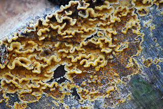
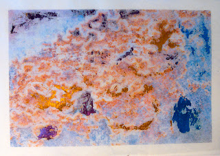
I started with one of the images that I took on my first trail run with my new (well second hand) Nikon D200.


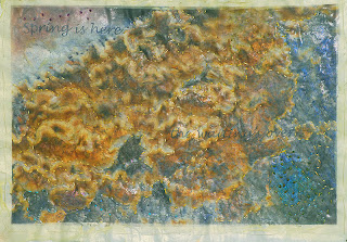
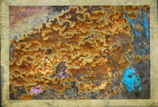
I printed this image onto Gimpy tissue, which was coated with IA iridescent gold as mentioned in the previous post.

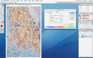
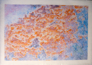
When I removed the tissue from the paper I had stuck it to print, it left an impression behind that I thought might be useful, so I scanned it into the computer and then strengthened the color of the image by going to, image-adjust-hue/saturation and playing with the sides until I reached the color depth I was looking for.


I then printed this onto a piece of Abaca tissue that was not precoated, as I didn’t need a very strong print because this was destined to go under the Gampi tissue.


I then added some of the foil that I’d bought from Fibre in Form using the turquoise, gold, copper and purple to match the colours seen in the original image. I found the best way to achieve a distressed look with the foil was to put down a very thin layer of diluted PVA and then lay down a piece of foil, shiny side up, in the place required. I then applied the iron gently on a wool setting before the glue had dried.


Once I was happy that I’d achieved the effect I was after I bonded the under layer to the top with Bondaweb granules.


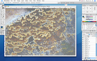
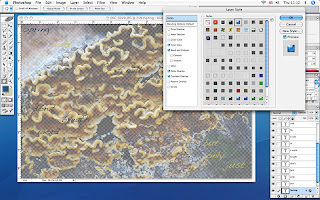
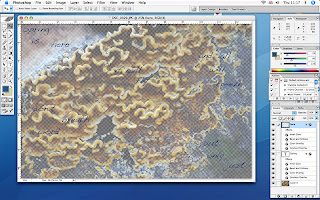
I now thought it would be nice to add some text and played around in PS with several text layers on a background of the original image, that I had lowered the opacity on. A PS tip here is that if you want to make your BG into a layer so you can work on it with filters or lower your opacity, you only need to double click the BG in the layers palette and that will give you the option to make it a layer.


Having got the text the right colour I decided that it didn’t stand out enough so I added a treatment to it in the Layer-layer style-blending options-styles palette.


I chose a style that gave a blue glossy embossed look, but there are lots of lovely styles to play with in this palette, it’s well worth having a play!


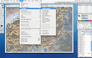
As you can see all the text is in different colours and I wanted to apply this layer style to all the text. To do this I made the BG layer disappear from view by clicking the eye in the layers palette (sorry no screen shot for this), this then just left the text layers visible. Now if you go to the layers pallet and click on the fly-out menu at the top you’ll see the options in the screen shot below. If you choose merge visible it will flatten all the text layers allowing you to apply this style to all.


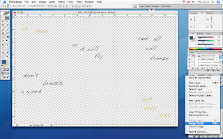
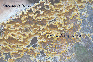
And finally you have the text layer with the embossed style over the BG layer.


The experiments for printing this part of the piece can be seen on the previous post. I wasn’t happy with the results I had achieved with the sheer so I tried again.

The only problem was that I made the classic mistake of not saving the image file above, or loosing it in the vast expanse of my computer’s hard drive!! So I decided to make a simpler version, and this time I used IA Semi gloss precoat on very pale yellow nylon sheer, and gave it 2 coats.


This worked far better than the previous sample, leaving very little ink on the paper and I think that may have been caused by the bubbles that I created when I coated it, haven’t quite got that one right yet!

My only concern with this technique is that it does make a very plasticized finish, which I don’t really like, but it did print a very good image on the nylon sheer, and I don’t know of another method that can achieve this.

When I bonded this top layer to the middle layer the registration of the two images we slightly out giving a blurred effect, which at the time I quite liked, but now I wonder if it would have been better to have kept the crispness of the original image.

Finally I put all the layers together and put a layer of thin wadding underneath with a backing of fine Indian cotton, bought from a luscious Indian fabric shop in Cardiff. I then proceeded to embroider over all the layers with Running stitch and French knots using hand dyed silk threads, also bought in Cardiff at the Crafts in the Bay Centre. The result was still not quite right so I tried the heat gun on it but found that the IA precoat didn’t allow the sheer to burn, so it only distressed in places where the precoat was at it’s thinnest.

I will live with this piece for a while and see if I can think how to improve it, unless anyone has any better ideas!