I‘ve been trying out an introductory set of InkAid samples over my last two DCD’s and decided to record my findings as you always forget how you achieved the results of the experiments almost immediately.
For those who are not familiar with IA as I wasn’t, till Shirley introduced me to it, it’s a series of different mediums that you can paint on to anything you can safely feed through your printer.
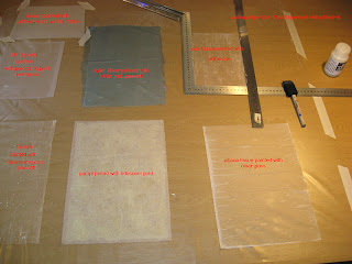
First of all I took 7 different surfaces to paint the different solutions on to.
Japanese Sanwa tissue, painted with semi clear gloss
Gampi tissue, painted with iridescent gold
Albaca tissue, painted with clear gloss
Silk organza, painted with precoat type II semi gloss
Nylon sheer, painted with white matt
Lens tissue, and tracing paper painted with adhesive
Velum, painted with white matt and adhesive.
To understand the different properties and uses for each of the above samples I went to the this site and followed the instructions for each of the samples in my pack.
Using Shirley's advise, I set out a plastic sheet and painted each piece in turn with a sponge paint brush, but I think maybe a block of foam would have been easier as it makes less wrinkles, according to Shirley, I held the pieces down with metal rulers, as it would have been difficult to tape some of the finer tissues.
The first piece I printed was the lens tissue, and although I’d painted it with the adhesive which was for non porous materials as I thought it was, the printer wheels slipped over the crispy surface and left drag lines on the image, so undeterred I had another go on the abaca tissue, a much softer tissue, which with the help of the clear gloss precoat gave a similar image to the one I’d achieved before on tracing paper, but this tissue is stitchable.
The next sample I tried was the nylon sheer, which was painted with the white matte precoat as this is designed for nonporous materials. When it dried it had some large white puddle marks on it, so I can only assume that I painted the medium on too thick. But it did print, which is the first time I’ve been able to print sheers. I deliberately put a low opacity on this image as I wanted the layers beneath to show through, but if I’d printed it with a high saturation it would have printed even better, maybe 2 coats of precoat next time.
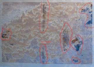
This piece does have some text on it, as I wanted to add it to the layers I was compiling for a piece, which I will publish when it’s finished.
I printed this same image onto silk organza, coated with precoat type II semi gloss which gave a much better effect.
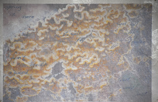
Another part of the above piece is the starting layer that I printed onto Gampi tissue, which was coated with iridescent gold. So far this piece has been the most successful for the image that I was using, it gives a lovely pearlised finish, which just glimmers through the image.
I still have a couple of samples to try for this experiment and will document them at a later date, together with some test samples that haven’t been precoated. All the paper samples were bonded to pieces of photocopy paper with spray mount before putting through the printer, and the fabrics were ironed on to Freezer paper.
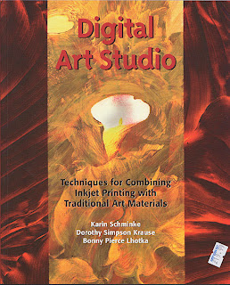
The tissues and the InkAid sample set were purchased from ArtVanGo. I also bought a very good book on the subject of Digital Printing from AVG, which again was recommended by Shirley who is a mine of information and has very generously shared her knowledge with me.
Tuesday, 29 January 2008
Monday, 28 January 2008
Claremont Gardens
It was such a gorgeous day yesterday that it was far too nice to stay indoors, so after a lovely long coffee and chat with our children at a local garden centre, to celebrate my OH's birthday (on Thursday), we headed off for Claremont Gardens near Easher in Surrey. This is a National Trust property, which has a large lake and some beautiful walks amid huge specimen trees.
It was such a lovely sunny day that I think most people thought of it as little haven , so close to London, but being quite large and spread out with walks all over the place it absorbs large numbers of people quite well.
I took the opportunity to have another test run with the Nikon D200, and I'm pleased to say it didn't disappoint me. I had tried to take these huge carbunkle lumps on some of the trees once before, with moderate success. This time I paid more attention to my camera settings, thanks to a very patient OH, and with the camera on a tripod managed to get it nearly right this time.

Im afraid I don't know the history of the gardens that well, but there are one or two lovely sculptures dotted about the place, so I thought I'd have a practice at getting the texture of this bear, as he was so well weathered.
Further on round the corner I discovered this lovely peacock with all these beautiful textures and patterns, what a great starting point this could be for a design! He was in deep shade , so I had to use flash, especially as I was hand holding the camera at this point and it has a large heavy battery pack on the bottom at the moment. I don't know if I'll keep this attached but apparently the camera is battery hungry!
On our way out I decided to take this shot of the amphitheatre, just to see how it would come out , hand held. I had to have a couple of goes at it as there were a lot of bright areas for the camera to cope with , but with al little help from my OH I figured out how to do it.
So it was another good session with the camera and , so long as it helps me out when I come to take the pics of my work I think we'll become the best of friends!!
It was such a lovely sunny day that I think most people thought of it as little haven , so close to London, but being quite large and spread out with walks all over the place it absorbs large numbers of people quite well.
I took the opportunity to have another test run with the Nikon D200, and I'm pleased to say it didn't disappoint me. I had tried to take these huge carbunkle lumps on some of the trees once before, with moderate success. This time I paid more attention to my camera settings, thanks to a very patient OH, and with the camera on a tripod managed to get it nearly right this time.
Im afraid I don't know the history of the gardens that well, but there are one or two lovely sculptures dotted about the place, so I thought I'd have a practice at getting the texture of this bear, as he was so well weathered.
Further on round the corner I discovered this lovely peacock with all these beautiful textures and patterns, what a great starting point this could be for a design! He was in deep shade , so I had to use flash, especially as I was hand holding the camera at this point and it has a large heavy battery pack on the bottom at the moment. I don't know if I'll keep this attached but apparently the camera is battery hungry!
On our way out I decided to take this shot of the amphitheatre, just to see how it would come out , hand held. I had to have a couple of goes at it as there were a lot of bright areas for the camera to cope with , but with al little help from my OH I figured out how to do it.
So it was another good session with the camera and , so long as it helps me out when I come to take the pics of my work I think we'll become the best of friends!!
Saturday, 26 January 2008
Unexpected purchases
I went to the Stitch and Creative Crafts show at Sandown Park today with my DD, Hannah of Cocnnecta Baby Carrier fame. We thought it would be a nice little jolly for the two of us as we're both interested textiley creative things.
It was a nice little show, not too big and busy, so not so tiring as Ally Pally. After we'd spent at least 20 minutes drooling over all the books on a strategically placed stand near the entrance, we both spotted these super little shopping trolleys. Hannah assured me that these are very trendy, so without further persuasion we both bought one, and boy what a difference that made to the day's shopping, no more heavy shoulder bags biting into your skin! Hannah’s decided hers will be brilliant for carting all her baby stuff etc. when she has her DD in a baby carrier, and mine will be used for photo/art stuff!! It wasn’t quite what I’d planned to buy but certainly kept us busy all day with enquiries as to where we'd bought such a handy item. I think we should have charged the seller commission!!
My next purchase had to be a book of course, and what else but the new Jan B and Jean L, Embellish and Enrich, which I hope will kick start my embellishing on the Janome, which has taken a back seat lately.
My final purchase was a big surprise and totally unexpected, as it was the wool to make a beautiful cardigan. The stall holders had cleverly hung up a completed cardie, which of course I had to try on and having seen how nice it looked I had to buy it. I'm thrilled, it was the purchase of the day as I’ve been longing to do some real knitting since this big revival took off and it's so nice to know it'll look good when it's finished.
The other treat for the day was sitting and drooling over all the lovely sewing machines on the market plus the embroidery software. Hannah and I were very impressed with Husqvarna's 4d sketch program which allows you to draw designs on a Wacom tablet which are then immediately translated into stitch on the computer. Just like drawing in free machine embroidery, but changeable if you don’t like an area after all. I'm still no further in deciding on a replacement for my ageing Bernina 1130, but it was great to get a few more ideas.
It was a lovely day out, and a really friendly atmosphere.
Wednesday, 23 January 2008
Holiday blues
As all my experimenting and creative adventures of my last DCD (dedicated creative day) are either waiting to dry or need to be edited I thought I'd share some of the reasons why I have a newly discovered love of Whitby, in North Yorkshire, and the surrounding area.
We went there for the first time last March and stayed in a cosy little ground floor flat in a Victorian house, right on the sea front at Sandsend. We could actually sit in bed and see the sea through the living room window!!
The weather was typical for March with winds that threatened to tear your skin off, icy rain, blizzards and snow!! But it still turned out to be one of the best holidays we've had for a long time. I think part of it's success for me was the fact that it had a table in the bay window facing the sea which was perfect to sketch from, in the warm and dry, while my OH was braving the elements to take pics of any birds daft enough to be out in the elements.
We had some of the highest tides of the year and as you can see from this pic our poor old van nearly ended up in Norway!!
Or wherever the nearest land would be. It was quite frightening to Southerners who rarely see such extremes of weather!!
We did go exploring off across the moors and found this beautiful, haunting abbey, it's name is Rievaulx, unfortunately it was closed but I had a long lens and managed to get several shots of the arches.
Above the Abbey is a National Trust property, the name is lost to me I'm afraid , but it had a terrace that was completely covered in snow, so I amused myself taking pics of my footprints. I especially like this one as I think the centre pattern on the shoe reflects the shape of the leaf.
While we were there we walked the 3 miles from Sandsend into Whitby and had a look at the lovely patterns on the boulders that lined the sand, they were particularly beautiful after the rain.
This lovely design was carved on the harbour slip way, way too good a design source to miss.
The people we met were all so friendly and ready to chat, which is a rare thing in the fast pace of the South East, and there's a super craft shop in the town with a lovely lady who introduced me to the delights of Mulberry paper and even told me how to tear it when it's wet.
We've been planning a return visit this year when we go to the Farne Islands to see the puffins, so it was really nice to revisit last year's pics.
Sunday, 20 January 2008
Outside at last!
At last we managed to find a window in the weather today and took the opportunity to go to a local Arboretum. It's called Winkworth and is on the outskirts of Godalmimg, Surrey.
It's a large area that comprises of a lake and long tree lined walks with all sorts of lovely specimen trees. We were delighted to see drifts of daffodils all over the place. It seemed very early to me, but then I'm no gardener! There were quite a few other flowers bravely sproting their blooms, including this lovely primrose, which is one of my most favourite flowes.
I couldn't resist taking a closer look at the bark on the log in front of the daffs as there were some wonderful textures in there.
They'll definitely need further investigation, this one reminds me of a drawing, and the one below it could be the start of a textile collage.
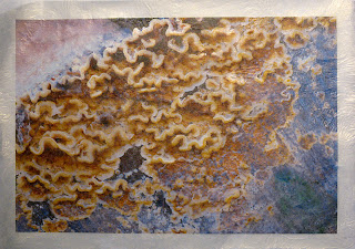
On our way back to the car park I noticed these tiny fungi on on a tree stump and thought the convoluted pattern was just gorgeous.
The final shots of the day were of some beautiful decorative birch trees, ( don't know the variety) that had the most gorgeous pink and green bark.
This last shot's not mine, they were all blurred! No tripod!!
Part of the purpose of this photographic extavaganza was to test drive my OH's Nikon D200, as a result of an email conversation with Shirley, who's recently traded up to one of these 'all singing, all dancing cameras'. Mine is a humble D50, which I spend my entire life complaining about and giving my poor OH greif over because I can't make it take good pics of my work!!!
But! Now I have an even bigger problem because my OH's D200 is rather good, (well very good) and as he'd like to trade up for another D300, so I could buy his old one , it's back to decision time again! More textile supplies or tighten the belt and go for a new camera!!
What to do? Thanks Shirley
Friday, 18 January 2008
February postcard- into stitch!
I finally got round to taking the CG February PC into the final stage. I printed off the two layers of the design on to Extravaganza, as mentioned in the previous post. I was delighted with the result, this organza is very light and transparent, but it holds the printed image really well, keeping the density and quality of the marks true.
I had dyed a piece of Viscose Satin the day before with turquoise Procion dye. I bonded a piece of turquoise foil bought from Fibre in Form to it and it worked like magic!! I used Bondaweb as the adhesive and gave it just enough heat to stick in places, so I got a distressed look. I was so pleased this worked as I've had trouble with other foils not wanting to part from the plastic carrier. With the two shiny surfaces, this was very difficult to photograph so I'm afraid you'll have to forgive my sad effort, but it gives an idea of the distressed effect.
Next I floated the two separate layers over each other, but whichever way I put them the one seemed to cancel out the other.
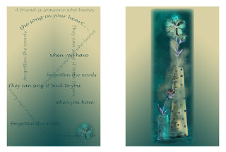
So I decided to cut the background away from the flower and lay the remainder over the words layer, therefore retaining the little bloom on the right hand side, which had all but disappeared under the top layer. I deliberately placed it on the thirds as my OH is very keen on this rule in his compositions and I rarely bother, but this time I think it worked.
As I didn't want a shiny residue from Bondaweb I used the granules, which stuck relatively well but probably won't hold the layers together permanently , I don't know what the answer is to fusing very light fabrics to a surface without any evidence of the bonding agent.
I then laid down some threads and beads to get an idea of how they would look. I knew I'd have to attach the flower layer permanently so chose a plain running stitch with a slightly variegated thread. I put beads on the dots on the vase and as this was a friendship PC I put on some heart beads as a finishing touch.
This image shows the true colour of the foil and just how shiny it really is.
I've really enjoyed putting this PC together as it's a constant aim of mine to bring together the computer composites I design with textiles, and most of the time I prefer the original design to the finished textile piece, but I think this one has worked better than most of the ones I've tried in the past.
Wednesday, 16 January 2008
Lovely day
I went on line this morning to check my emails and found one from Karen, she'd thoughtfully sent me a link to a super little freeby preview for an apllication that organises your 'to do' lists, sorry guys I think it's for Mac users only!! Thanks Karen I shall enjoy playing with this.
I then went to work for my daughter making more straps for her baby carriers and we had a great catch up chat as she's just been to Centre Parks with her children and has come home exhausted after trying all the ativities, including scuba diving!! It was so nice to enjoy each other's company and have a laugh with her and her OH, even if we were working.
When I got home the postman had been and left this wonderful post card that Carol sent me. It was a wonderful surprise RAK, thank you so much, Carol. It was one of a series that Carol made for the Calendar Girls' challenge for January. If you'd like to see the whole 13 post cards and a very impresive set just posted by Lynda then pop across to the CG blog.
To finish the day off I had a visit from my GS, Ben , who wanted to download the pics he took at the car show, Piston Heads, in Birmingham on Sunday.
Judging by the look on his face, I think he had a super boys day out with his dad, LOL.
Needless to say he took 50 shots and knew the name of every car! Funnily enough, this picture of an AC Cobra (see I was listening) was my favourite as well as his, how's that for 'Nanny synchronicity'
Monday, 14 January 2008
Mixed post, catch up
Things seem to be moving pretty fast since we all returned to normal after Christmas. I'm just getting used to the routine of having 2 dedicated creative days (DCD's) a week, which I am trying to be very professional about and not do anything unnecessary like answering the phone/e-mails, checking the blogs (that's a tricky one) till at least after 7.0pm!
Then there's all that forward planning to be done re possible exhibition venues and of course the C&G rumbling away in the background, and the lovely Callendar Girls, hummm! I think I may be over-stretching myself yet again. Oh! and then there's work to be fitted in somewhere!
So here's a bit of a catch up on a few things.
Firstly I received this beautiful post card from Susan.It's a beautiful sunny post card which has done wonders to cheer me up every morning since I received it. The colours and the stitching are superb. If you'd like to see more go to the Calendar Girls blog and you'll see how Susan designed and made it, as it's her January post card for this challenge.
The second lovely thing that happened was that I received the 'You make my day award' from Shirley, thank you so much, I'm very flattered. There are lots more people that I would like to nominate for this award, but as I've just handed out a few maybe I should stay quiet for a bit LOL.
And now for a bit of the creative stuff!
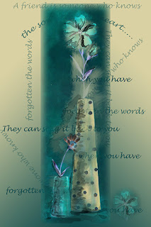
I've been having a think about the February post card for the CG challenge and this is what I've got so far:
I decided to work with just part of the source image (see above) for the February post card and cropped the left hand side quite tight.
I then put it into PS and worked a watercolour tutorial from, Photo Effects Cookbook by Tim Shelbourne. This tutorial was designed to convert a photograph into a watercolour. The effects I have created are a little different as I started out with a watercolour sketch, but I wanted to see if I could make the original image a bit more textured.
Half way through this process you had to go to Image-Adjustments-Invert, which inverts the colours in the image.
I liked the effect so much that I copied this layer to another file and created a gradient fill underneath it, as it wasn’t the right format for the post card.
Having done this I decided it needed something more so I took the text from the original source and laid down random sentences.
As a final touch I selected the main bloom, pasted it in the right hand corner and set the opacity to 52% .
I'm now thinking I might print this onto some Extravaganza that I recently bought from AVG on a rather expensive shopping outburst! So I've copied the text and small bloom layers on to an A4 file and done the same with the flower and BG layers, so that I can lay one over the other. So I shall see if it works tomorrow!
Saturday, 12 January 2008
Mood board
Continuing the Colour Studies theme, in the next exercise we have been asked to design a mood board, which should 'capture and convey the essence or mood of the subject or theme.'
After much deliberation, usually as I'm trying to get to sleep, I managed to pin down the subject matter for this exercise to 7 possibilities.
Whitby, because we had a great holiday there last year and I've fallen in love with it!
Family, for obvious reasons.
Childhood, for no apparent reason.
The seaside, because I just love to be near the sea, it's so infinite and always puts everything in perspective.
Freindship, I suppose because all this blogging has really brought it home to me just how wonderful friendship is.
Provence, beacause I've had some of my most favourite holidays there both as a child and with my OH and our children.
Happiness, beacuse it feels so great when you are happy.
I finally decided that out of this seven the choice had to be Provence, because at the end of the day this is a colour exercise and of all the things that make it special, I think it has always been the beautiful colours that are everywhere you look in the region. From the rich brown earth to the 'unreal' blue sky.
Also, by way of a decider I have the 'Tricia Guild on Colour' book and a lot of her colour schemes are based around the Mediterranean colours. It is a superb colour reference for any kind of creative project, the photos are brilliant.
I really enjoyed making this colour board and hope it will inspire me for future projects.
Thursday, 10 January 2008
You make my day award
I was delighted to find that both Julie and Karen have given me the 'You make my day' ward. I was very surprised and honoured to get it as I've not been blogging that long, and thank you both for your lovely remarks and continued support on my blog, it is much appreciated. As are all the comments I receive, it's given me more pleasure and encouragement than you can possibly imagine.
Now! the rules of this award are apparently as follows:
“Give the award to up to 10 people whose blogs bring you happiness and inspiration and make you feel so happy about blogland! Let them know by posting a comment on their blog so that they can pass it on.
So here goes:
The first person I'd like to give the award to is Julie herself, which is probably not the point of the thing, but she truely does make my day, with her delightfully varied blog, she also knows what a 'muppet' I am when it comes to anything that masquerades as a soft toy, but of course is really a disguised human.
Then there's Debbie who's been around for me on so many occasions when I've got some sort of problem or other and of course runs a really varied and exciting blog, and is one very tallneted lady.
Shirley has been a mine of information for me , and nothing is ever too much trouble when it come to explanations and help with the endless things I know nothing about ! She also has a fantastic blog and is a frighteningly prolific worker.
As far as sharing knowledge and offering free tutorials is concerned few could surpass Lynda's generosity.
Then there's Helen who's wonderful intuitive turn of phrase can so easilly make sense of the knottier issues that some of us seem to get stuck with, to say nothing of her wonderful tallents in seemingly endless directions.
I would also like to give this award to Karen as we have only recently been regularly blogging but she has been very supportive, and I am very grateful and am learning slowly about unfamiliar artistic areas from her lovely blog.
Jacqueline is a constant source of inspiration to me and often makes me silently exclaim "WOW'! when I visit her blog as her work is so different and beautiful!
I have made so many new friends on the Calendar Girl's group, it would be nice to make the award to them too, so I'll do that collectively.
Also although he hasn't got a blog I couldn't possibly not include the one person in my life who makes my day every day, my
OH
Thank you to all who contribute their comments to my blog, it is very much appreciated.
Wednesday, 9 January 2008
Collage to Photoshop
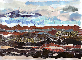
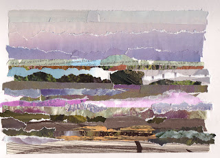
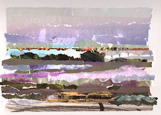
One of the exercises for my colour studies required taking a picture/sketch of a landscape and then “collecting a range of scraps of coloured papers or cut up magazine photos in proportion to the colours you notice in a picture of a garden or landscape”
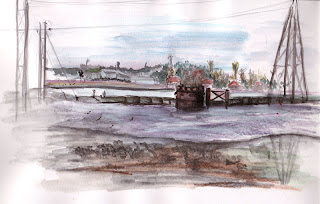
I decided to use the Hayling Island sketch as my base image. I was quite pleased with the result as the first time I tried this exercise on a Whitby holiday scene, see below, (while imitating a page from Sandra Meech’s sketch book, Contemporary quilts Design surface and Stitch p.75) I was too literal in my interpretation.
This collage was done from memory and so I suppose it would feel different to the one I’ve just done with the sketch in front of me.
Having completed the collage I wanted to see if it would convert to an abstract painting, but as it was blowing a gale outside and nearly dark I didn’t fancy decamping up to the garden shed/studio!! So I headed for PS instead and after a couple of hours I had an abstract pattern, but not a painting, all good fun though and I learnt a lot into the bargain.
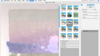
First of all I tried the pallet knife filter, which lives in the Filters-Artistic menu, after checking out most of the other filters (that’s where the time goes!)
This is the result after the filter has been applied using the above settings.
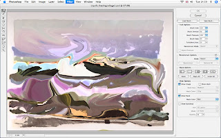
Next I decided to move the elements of the collage around as if I was painting, so I did this with the Liquify tool, which lives at the top of the filter menu. I must admit I just played with all the tools to see what they felt like, a bit like playing with different size paintbrushes.
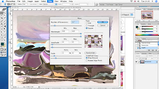
Next I decided to see what I could do with more action so went for the wave filter, which lives in the Filter-Distort menu.
I discovered that if I chose the Square option and played around with the other controls I could get quite a nice patchwork effect! I emphasise the word play as I don’t really understand the technicalities in the various options, so lets hope there are no serious PS offianados looking at my blog!!!
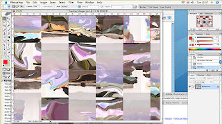
Here’s the result so far:
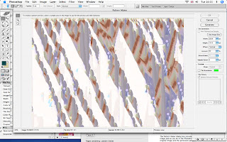
You will see from the above pic that I’m on to yet another track. I wasn’t that happy about the solid pattern lines of the squares and decided to see what the Pattern Maker could do. This lives in the same place as the Liquify tool.
I selected the red outlined square above to use as a pattern and used the selection tool to select it.
Again I just played with the various options in this filter and selected the best-generated pattern from the preview.
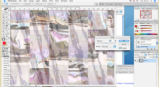
The pattern that it generated covered the original image so I selected the fade pattern option from the edit menu and dropped the opacity to 47% leaving the mode set to normal.
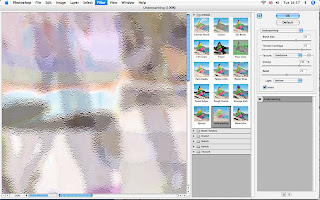
As a final touch I put an Underpainting filter from the artistic selection and put a fade on of 70%, as seen above, to give it some texture and set mode to multiply to give it a bit more depth.
As with most things there’s always one more little thing you can do and this was no exception.
Whilst rooting around the various menus I discovered the Equalise option from the Image-Adjust menu. This gave it an amazingly zany phsycadillic colour which was just a bit too OTT, so I whacked on the fade again and knocked it back to 22% but then bought it back a little by setting the mode to linear burn and ‘voila’ the finished piece.
This has been completed on PS CS , which as those who are familiar with the program will know, is an older version, as the current one is CS 3, but for the time being CS does everything, and more than I need at the moment so I chose to spend my money on more exciting things than the upgrade!
Subscribe to:
Posts (Atom)